Monday, December 26, 2011

Trends~worth following?

A new year is only a week away.  January seemed so far away even only a month ago to some, but for the trend setters, they're looking beyond March already.  2012 is about possibilities....

While I read and gather information from many sources to stay up with the trends, I don't tend to jump on the bandwagon first thing.  I like to observe, analyze, see how it relates to me and/or my clients needs. How can the trends help ~make color personal~ and not just trendy?

In my color world there have been many posts as to the 2012 colors of the year.  In case you missed part of the color buzz...

Benjamin Moore's color of the year is Wythe Blue HC-143. 

It is actually one of my 'go-to' colors because of its blue/green hue.  It can add a punch of color, but can be soft and spa like too.  It is very versatile.

Pantone's color of the year is Tangerine Tango.

This is a vibrant, energizing color that demands attention!  It is an orange/red that is not for the timid.  Actually, the timid could start with baby steps by using the color in accents. 

Notice how the above two 2012 colors of the year work together?  Blue and orange are complementary colors~opposite each other on the color wheel.  The trick is to keep the saturation similar so one doesn't overpower the other; the two will make the other stronger already.


Akzo Nobel's color of 2012 is a blushy red.  Their prediction is 2012 is all about possibilities.  The link in this paragraph is an informative read.

Color Marketing Group (CMG) chose Boyz-n-Berry as the 2012 color.  It is a
warm plum color with red undertones, not blue. 
The link for the source of the plum picture is another informative (shorter) read.

With more than one 'color of the year' I hope you find some inspiration and work a new color or two into your home.  If you would love to, but just don't know where to start, contact me for a color consultation and we'll make a 2012 color 'personal' to you!

Happy New Year!
Jill

Monday, December 12, 2011

Won't the Color Look Darker on the Wall?


A re-occurring question I am asked as a Color Consultant is if the color will look darker on the wall than on the 2"x2" paint chip available at the local paint store

Thursday, December 8, 2011

Re-Designing a Loft Office

Optimizing space.  Don't you love the look of an open room (no doors to close) that is pulled together, functional and welcoming?  Me too. 

Here is a client's loft/office space before I made some suggestions to open up the space:


As you come up the stairs to the second floor this loft/office space is the first thing you see.  I felt crowded, even though there is obvious room to walk around.  The office chair's 'back' to the room bothered me from the basics of feng shui that I know about too.

I sketched out a rough drawing of where the desk and love seat could be positioned and here is the end result:


Viola!  Nothing was removed, but the position of the desk against the half wall opens up the space now that more of the whole wall can be seen.  The dresser/cabinet stands out more now, but balances the desk too along the new wall, and the love seat feels more tucked in against the whole wall.  

Have a space you just can't make feel 'right' with the furniture pieces?  Contact me and I will help you redesign your space!

Best~
Jill

Tuesday, December 6, 2011

Change is Good

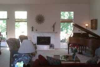
Great rooms can pose a furniture arrangement dilemma.  The furniture can just get in the way instead of creating a 'welcome, come and take a seat' feeling. 


In order to invite friends and family into the room a little easier, I suggested to my client to move the piano on the same wall, but facing into the room, and not hugging the wall.  This created a shift in the sofa, which allows the wing back chairs to flank the fireplace while creating a conversation "U". 


Now guests can enjoy the fireplace from all angles of the room, and foot traffic can go between the dining area and great room with ease.


When the Christmas tree comes down a curio cabinet will fill the space and add some height (although not 9'!) to the back wall.

Do you feel stuck with your furniture in the same old placement or wish you could move some pieces around to give the room a fresh look?  Contact me for a consulting appointment to help find a welcoming flow to your floor space.

Friday, November 25, 2011

Making Existing Colors Work

Turkeys roating with celery to help season
Celery--perfect food related to Thanksgiving prep; color of the day.


Wednesday, November 16, 2011

Photo Card

Classic White Solid Colors
Send Shutterfly Valentine's Day cards to those closest to you.
View the entire collection of cards.

Friday, November 11, 2011

Petoskey Stone

Michigan's state stone is the Petoskey Stone.  As a kid my family vacationed at a family friend's cottage and we would walk miles along Lake Huron's sandy shores in search of these beautiful stones.  We would collect them and paint clear nail polish over the dry stone to bring out the fossil details. 

Sunday, October 30, 2011

Crisp But Warm-How to Test Your Consultant's Skills

Challange of the week:  "I want crisp colors, and a warm feel" for my walls.

Initinally this comment contradicts itself, but I was able to come up with a palette for the main floor and second floor hallway that the client is very happy with. 

Color ReDesign color card
We met at the client's new house, but it was empty, so there were no inspiration pieces on hand and she didn't have any digital photos with her (adding to the challenge).  She had, however, surfed Benjamin Moore's Color Gallery and had a diversifed list of colors she liked online. 

We actually started with castleton mist HC-1, which will end up as a dining room accent color and worked the foyer, great room, kitchen, and library from there.  Three colors were on her list of suggestions, even though they looked different on her monitor (Please read my article about apps).  I found the great room main color, foyer, and trim colors, by adding and editing suggestions based on undertones to find that balance of 'crisp' and 'warm'  ~making color personal~ for my client. 

Do you have a room giving you more of a challange than you want?  Contact me to set up a consultation appointment and we will find the right colors that work for your space, making it personal to you!

Friday, October 28, 2011

Orange-Can You Use it in Your House?

This week I received many color source updates that orange is taking a leading role as color of 2012.  It will start in fashion and home goods, but will of course effect some paint color choices. 


This doesn't mean you have to make an entire room orange~but for a fun change you may want to infuse this symbol for power and happiness into a room or two.

Are you an orange person? 

Sunday, October 23, 2011

Gray could look Blue, Purple, or Green--Why?

Trying to find a gray but it looks blue, green or purple on your walls instead? That is because in basic Red-Yellow-Blue (RYB) subtractive color wheel terms, complementary colors make gray. Mixing blue and orange; red and green; or yellow and purple (violet) in equal amounts will make gray. 

These complementary colors also make each individual color look stronger if paired together. 

If your lighting is pulling the 'wrong' gray, you may need to change the hue of the gray to make it perfect in your space.

Contact me for a consulting appointment to help find that 'perfect' gray.

Color Apps-How They Don't Help


While technology keeps us all moving forward, faster, please keep in mind if you use a color app on your phone or laptop that color calibration may not be exact. They are great tools to get color ideas, but please don't order your colors off of the app or website info only! Stop into the paint store and get the actual color chip and/or sample jar to test it on poster board to see the color in the actual room's lighting. 

I am here to help ~make color personal~ for you, so don't go it alone! Contact me for a consulting appointment if you are stuck.

Saturday, October 22, 2011

Pass the Salsa Please!


Was so please my client stuck with her 'gut' and added a splash of red/orange to her kitchen.  It is a small space so we agreed that only the two 'main' walls (shown here) would be painted the Benjamin Moore color salsa dancing AF-280.  The other two walls that have little paintable wall space due to cabinets and the threshold to the mudroom remained an off-white that works well with her cabinetry.

If you want to add a splash of color to an area in your home but aren't comfortable taking the leap, call me to set up a consulting appointment and we will determine if it will work---or won't. 

Pass the chips please!

Saturday, October 15, 2011

Trust your gut

Today's color consulting appointment help remind me of my niche market.  I bring an unbiased, professional opinion to the table for projects that seem too daunting for an individual.  It seems a mother/daughter  meeting of the minds could not agree on the mother's condo new paint colors.  Definite generation differences. 

Thursday, October 13, 2011

Wednesday, October 12, 2011

Inspired by Color

Nature is such an inspiration to me of how color effects and influences our moods and senses.  Feast your eyes on this beautiful, strong combination of colors at the Pictured Rocks on Lake Superior in Michigan. 


Who says you can't combine certain colors!  There are many options here that could create a perfect pallete for a home interior.